Flikshop
Bridging the digital divide for social good. An ecosystem that incentivizes people to learn.

Client
Flikshop
Industry
Learning management system
Team
5 members
Advisor
Dr. Bill Kules
My roles
Designer · Researcher · Sprint facilitator
Method
GV Design Sprint, stretched to 5 weeks
Tools
Figma · TryMyUI · Unity · Adobe Premiere Pro
At a glance
Two apps, one economy
Flikshop lets families send photo postcards into any jail or facility in the country. My team's brief was to grow that single act of contact into a full ecosystem: FlikshopMe, an Android tablet app used inside the facility, and Flikshop Home, a phone app for life after release. The connective tissue we designed is a reward economy, Flikshop Bucks and badges, that turns coursework into currency and currency back into contact with family.
5
weeks, adapting a 5-day GV sprint to facility clearance timelines
8
interviews: 3 proxy users, 5 domain experts
2
apps unified into one ecosystem and one design language
4
features designed end to end, each with a clickable prototype
22 yrs
longest time offline for a proxy participant we designed with
0
current residents we were permitted to interview directly
3
reentry phases the ecosystem has to cover, not just one
1
component library built to survive per-facility security rules
The Bucks and Badges economy
Everything we designed hangs off this loop. Behaviour and coursework mint currency; currency buys back the thing people actually want, which is contact.
Where it started
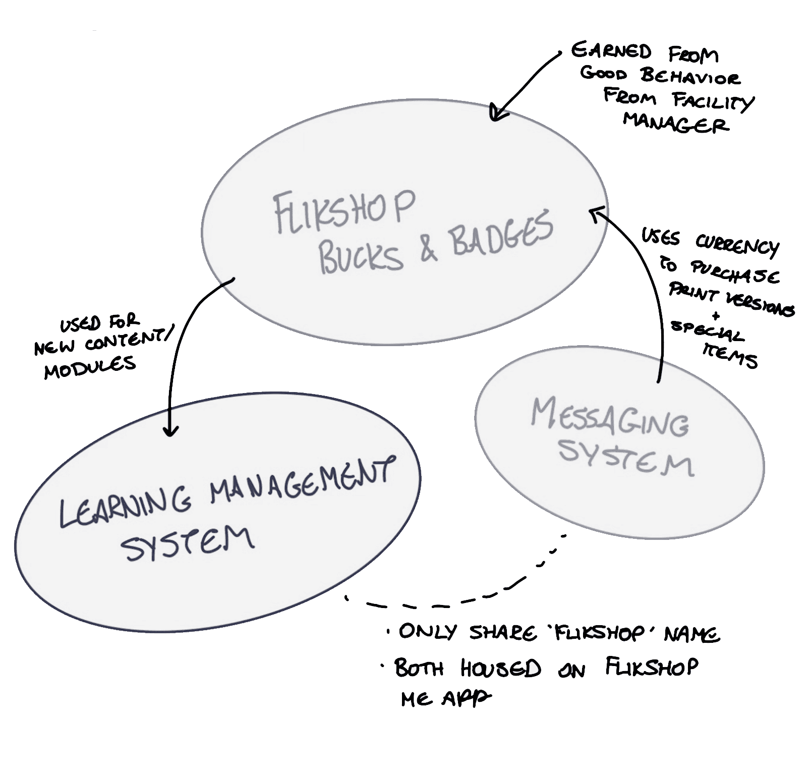
The same loop, on a whiteboard
The first version of the economy, drawn in week one. Bucks and badges sit between the LMS and the messaging system, with a note on each edge recording who controls it: the facility manager issues bucks, the LMS spends them, and both live on the FlikshopMe app. Every constraint in the diagram above was already written on this sketch.
01 · The problem worth solving
Two levers that actually move
Before a single screen, I wanted to know whether the product hypothesis held up outside the room. Two independent bodies of evidence say it does: people who stay in touch with family reoffend less, and people who study inside reoffend a lot less. Flikshop already owned the first lever. The LMS was the second one, unbuilt.
Evidence 01
Release is not an event
Of roughly 408,300 people released from state facilities in 2012 and tracked for five years, 71% were arrested at least once. Most of that happens in the first two years, the same window the ecosystem has to survive.
Bureau of Justice Statistics, 34 states, 2012 release cohort.
Evidence 02
Education is the strongest lever
People who take part in correctional education have 43% lower odds of returning, and the taxpayer return is roughly $5 saved for every $1 spent. That is the number that justifies gamifying an LMS at all.
RAND, meta-analysis of correctional education programmes.
Evidence 03
Distance quietly severs the family
63% of incarcerated people are held more than 100 miles from their families, and fewer than a third get a visit in a typical month. A $0.99 postcard is often the only channel left.
Prison Policy Initiative, Separation by Bars and Miles.
The window the ecosystem must survive
Cumulative share of released residents arrested at least once, by years since release
Every hundred miles costs a visit
Share of residents visited in the past month, by distance from their home
What correctional education is worth
RAND's meta-analysis restated three ways: the case for putting the LMS at the centre of the ecosystem
02 · Research under constraint
We could not talk to a single one of our users
Security clearance made direct contact with current residents impossible inside our timeline. Rather than pretend otherwise, we designed the research around the constraint: proxies who had lived it, experts who study it, and the client's own operational data. Every insight in this case study carries the caveat of how it was obtained.
How eight conversations became four features
Each narrowing step, and what it produced
8
Interviews
Three proxy users who had lived it, five domain experts who study it
1
Competitive scan
The social-care market, read for the gap where Flikshop serves the "Seeker"
3
Phases of reentry mapped
Inside the facility, the handover, and the long tail after release
4
Design insights
The findings that survived all three constraints, listed further down
4
Features designed
Each one taken to a high-fidelity, clickable prototype
Participants and experts are listed in the table opposite, exactly as recorded in the sprint.
Who we actually spoke to
Three proxy users and five domain experts, from the sprint's own research log
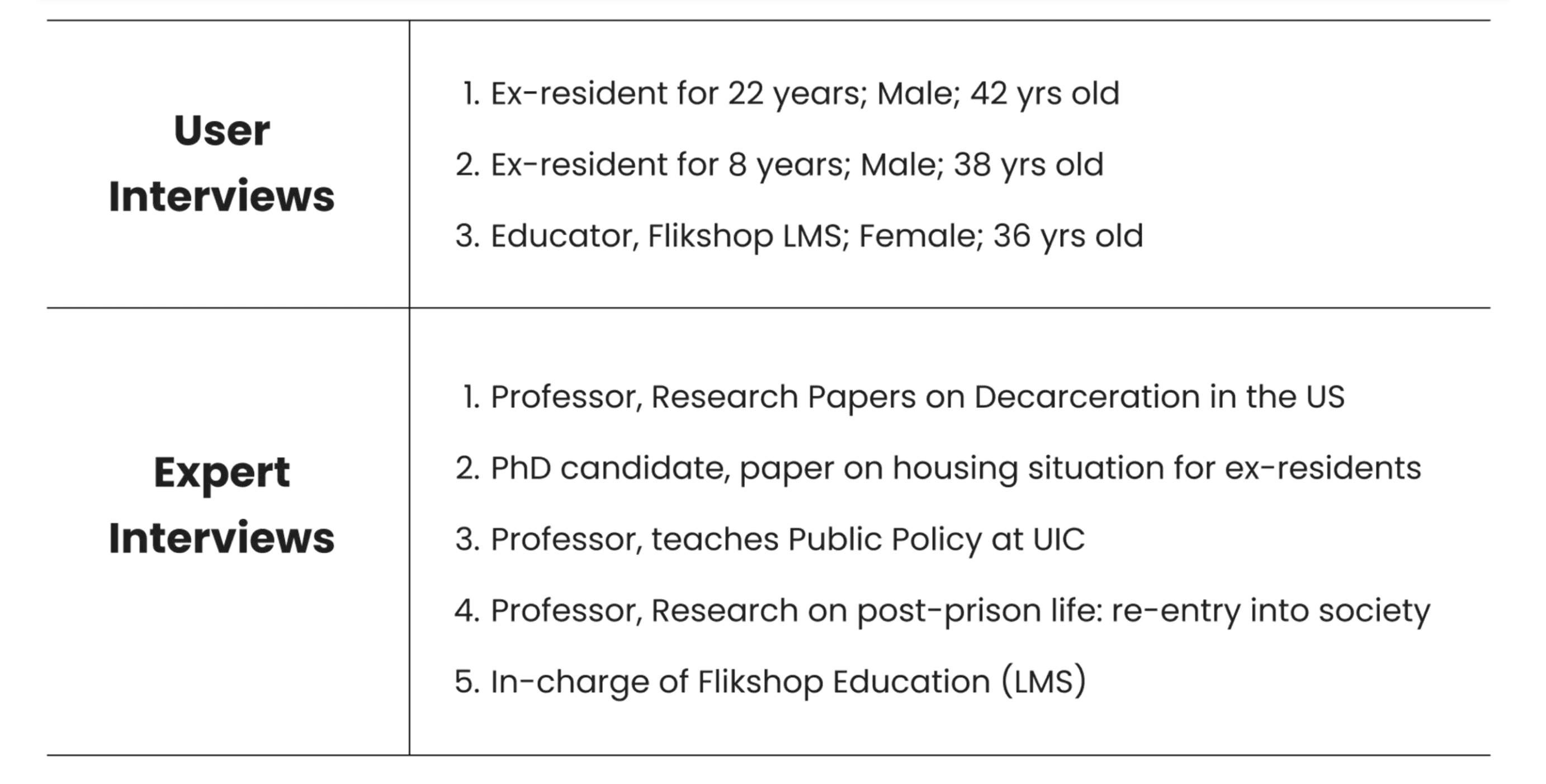
The two ex-residents had served 22 and 8 years. The 22-year participant became our accessibility benchmark for the entire component library.
Mapping the postcard first
A service blueprint of how a Flikshop travels from a family member's phone to a resident's hands, colour-coded by which surface owns each step

This is the artefact that made "regulation-ready" concrete. Every box that touches the facility manager is a box a state can veto, so the design had to degrade gracefully when one is removed.
Constraint 01
Logistical navigation
We researched facility protocols for digital postcards: what may be printed, what may be shown on a screen, what has to pass a human reviewer. Every feature had to be regulation-ready before it was pretty.
Constraint 02
Proxy research
With direct access restricted, we used expert interviews and ex-resident insight to build an authentic narrative. It is a real limitation, and it is why nothing here claims validated behaviour.
Constraint 03
Competitive analysis
We benchmarked the social-care market to find where Flikshop could uniquely serve the "Seeker", the person actively looking for a way back in rather than waiting to be processed.
03 · Synthesis
Three constraints, one design space
The brief was often described as "balance security with connection". That framing is one constraint short. There is a third: the range of digital literacy inside a single facility, from someone released last year to someone who went in before the smartphone existed. Anything that satisfies only two of the three is a feature we cannot ship.
Where a shippable feature has to sit
Satisfy two constraints and you get a prototype. Satisfy three and you get something a facility will actually turn on.
The literacy gap is measurable
Share of the U.S. incarcerated sample who could not or chose not to sit the national skills assessment on a computer
And the environment does not help
Number of U.S. states, out of 50, reporting each condition in correctional education
Reentry is three problems, not one
Our own phase framework from the sprint: goals, challenges and existing resources across the arc from inside the facility to long after release
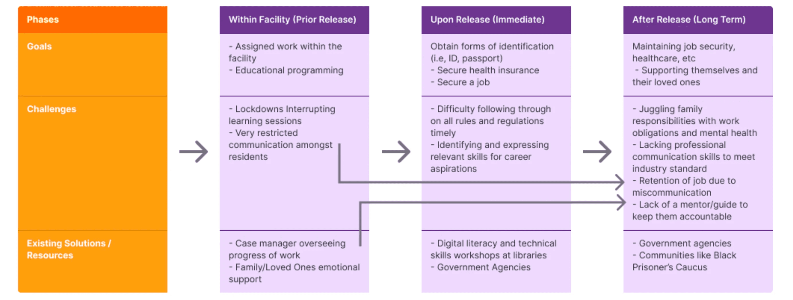
Matrix from the sprint deck; the product mapping underneath is the conclusion we drew from it.
Insight 01
The reward has to be contact, not points
Every proxy participant described mail as the thing that structured the week. A currency that buys a printed photo album for a daughter's birthday means something; a leaderboard does not. Bucks are denominated in postcards.
Insight 02
Consistency beats delight
For a user who has been offline twenty years, a novel interaction is a wall. We reused a single card, a single button and a single navigation pattern everywhere, and spent the saved effort on type size and contrast instead.
Insight 03
Anything a facility can veto must be removable
Security levels differ by state, so each feature was built as something that can be switched off without breaking the screen around it. Reactions degrade to a read receipt; the gallery degrades to a flat list.
Insight 04
The second app inherits an identity
Badges earned inside are the only credential many people leave with. Flikshop Home treats them as portfolio items feeding a résumé builder, rather than starting the profile from zero on day one.
Barrier to design response
Each constraint we could not remove, and the specific move we made instead
01
Varying facility security rules
→
One universal component library; nothing needs custom code per location
02
Up to 22 years away from modern UI
→
Strict type hierarchy, simplified iconography, high-contrast "basic" aesthetic
03
No free-form messaging permitted
→
Reactions and saved responses inside regulatory boundaries, not open text
04
No live internet for students in 26 states
→
LMS content and badge state designed to work offline and sync later
05
No access to current residents
→
Ex-resident co-review of every high-fidelity screen before handoff
04 · Process
A five-day sprint, stretched to five weeks
We ran Jake Knapp's Google Ventures sprint, but a five-day cycle assumes you can get an answer from a user on Thursday. Facility protocol does not work that way. As sprint facilitator I re-cut the same five phases across five weeks so that each decision point had room for a clearance round or a client check.
Week 01
Map
Service blueprint of the postcard journey; audit of what FlikshopMe and Flikshop Home each already did.
Week 02
Interview
Three proxy users, five experts, plus the client's anecdotal data. Competitive scan of the social-care market.
Week 03
Sketch
Crazy 8s at speed, then storyboards. Volume first, so that regulation could kill ideas without killing the day.
Week 04
Decide and build
Component library, then high-fidelity screens for the four features that cleared all three constraints.
Week 05
Review and hand off
Ex-resident walkthrough, four clickable prototypes, market study and roadmap delivered to the client.
Sprint wall
Design-thinking board with the review flow and the notes that survived it

Crazy 8s
Eight minutes, eight frames, no discussion until they are on the wall

05 · Design system
A deliberately boring component library
To be inclusive and scalable at once, we chose a "basic" aesthetic on purpose: clean, high-contrast layouts that stay performant on an ageing Android tablet and adapt across the whole Flikshop ecosystem, not just the LMS and postcards. Given the range of educational backgrounds and digital literacy, a rigorous type hierarchy and simplified iconography do more for comprehension than any amount of visual personality.
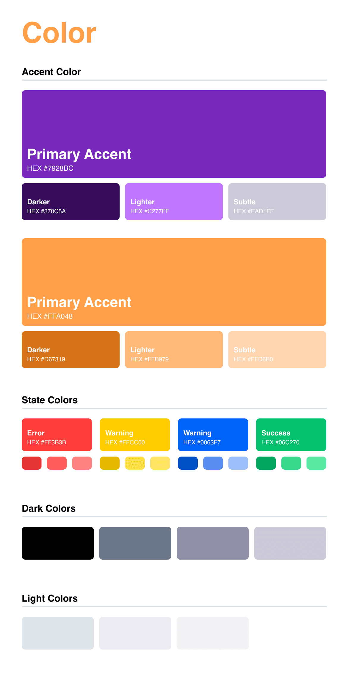
Colour
Accent, state, dark and light ramps
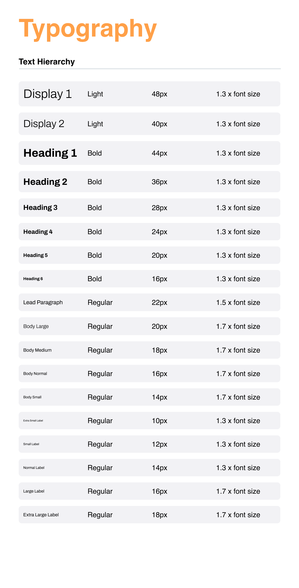
Typography
Display through caption, with fixed line heights
Components
Buttons, menu, accordion, cards

Rule 01
One type ramp, no exceptions
Display through caption is a closed set. A screen that needs a size we do not have is a screen with too much on it.
Rule 02
Icons never travel alone
Every icon carries a word. Iconography is a memory aid for people who already know the pattern, not a replacement for language.
Rule 03
Contrast over brand
Where the brand purple failed against a background, the background changed. The tablet is often read in poor light.
06 · What we designed
Four features that cleared all three
Three live on the tablet inside the facility. The fourth is the app waiting on the other side of the gate.
Feature 01 · FlikshopMe
Interactive digital postcards
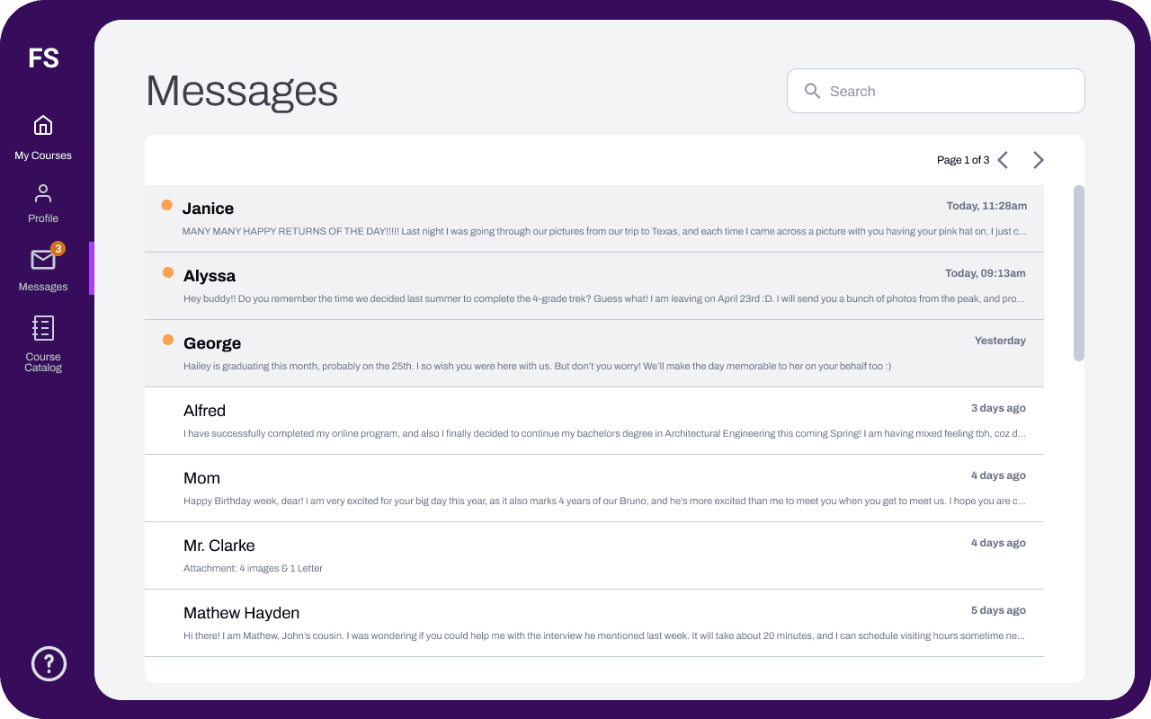
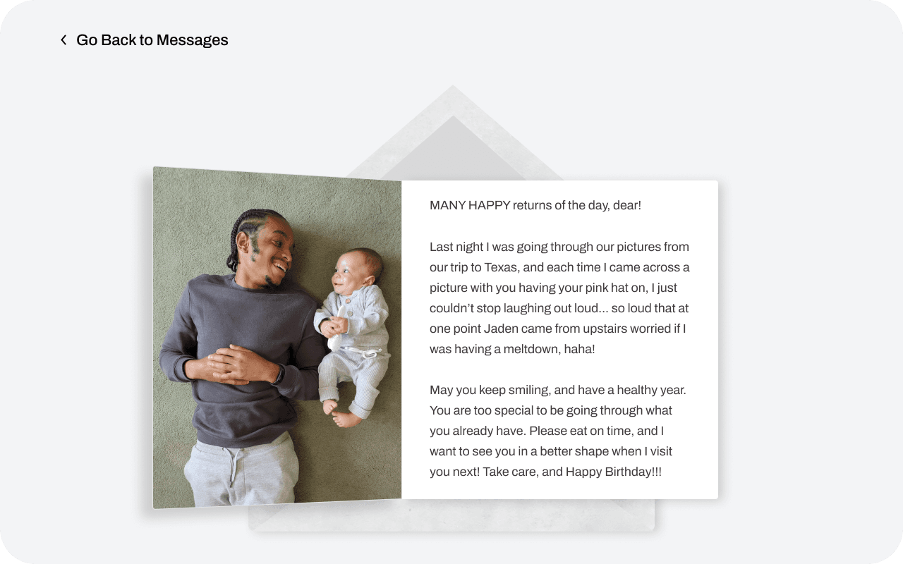
A "Flikshop" arrives as a photo and a message from home. We turned receiving one from a dead end into an exchange: residents can react to a postcard, save it, request a print, or file it into an album, all inside what the regulations permit, and without a free-text reply channel that no facility would approve.
The constraint that shaped it: open messaging is a non-starter. A fixed emoji set is reviewable, loggable and instantly understandable, which makes it the rare feature that satisfies security and low literacy at the same time.
Open prototype

Prototype walkthrough
Video slot, waiting on the file
Prototype walkthrough
Video slot, waiting on the file
Feature 02 · FlikshopMe
"Bucks and Badges" reward system
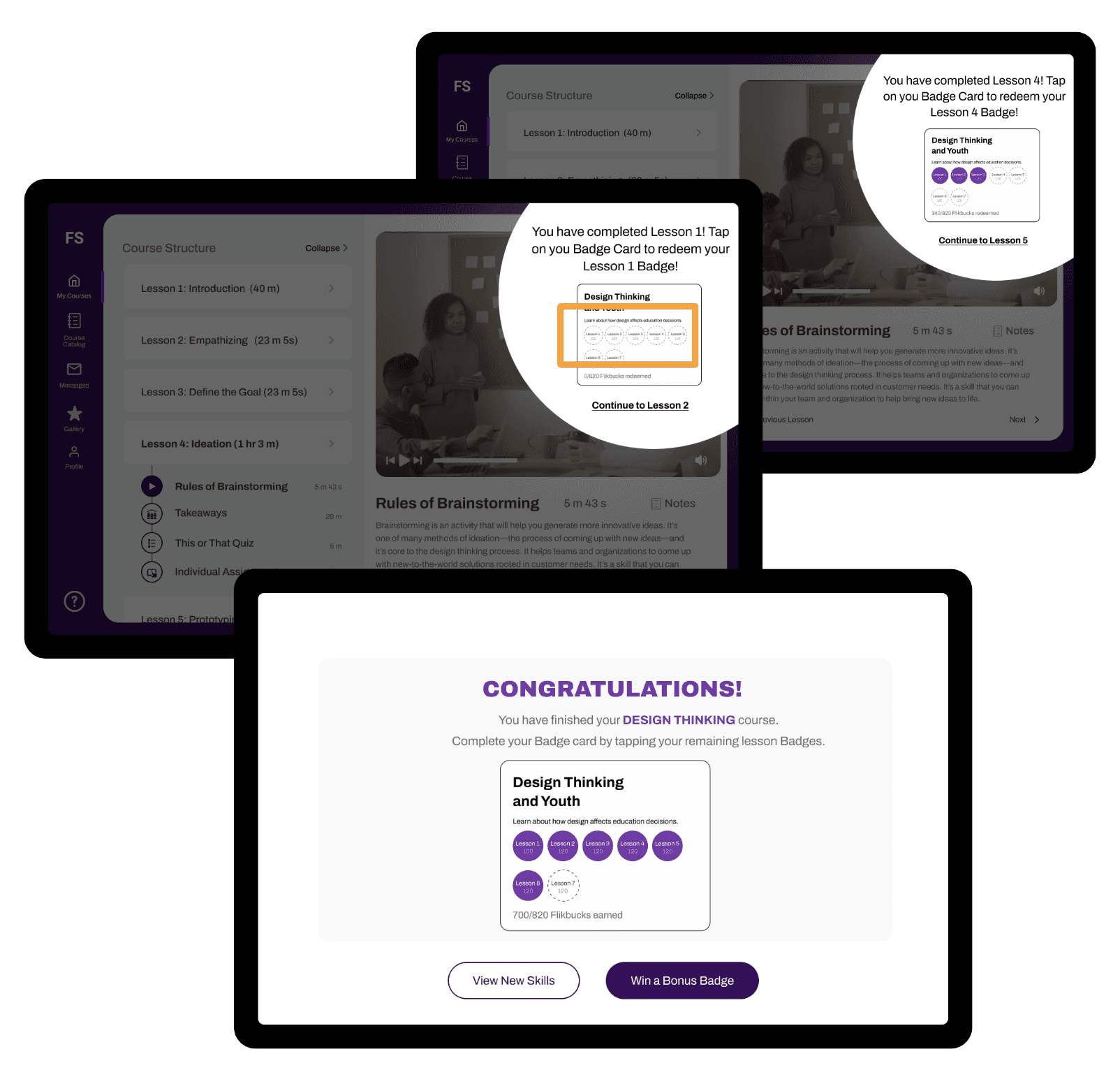
The piece I owned end to end. Residents earn Flikshop Bucks for positive behaviour, awarded by the facility manager, and badges for educational milestones in the LMS. Bucks buy postcards, prints and new modules; badges are the visible record of what was completed.
The design decision I would defend hardest: the currency is never redeemable for status alone. Every spend path ends in contact with a person outside, which is what the evidence in section 01 says actually reduces return.
Failure state we designed for: a facility that will not let staff issue bucks. In that configuration badges still accrue from coursework alone, and the wallet simply does not appear.
Open prototype
Feature 03 · FlikshopMe
Personalised gallery, real album
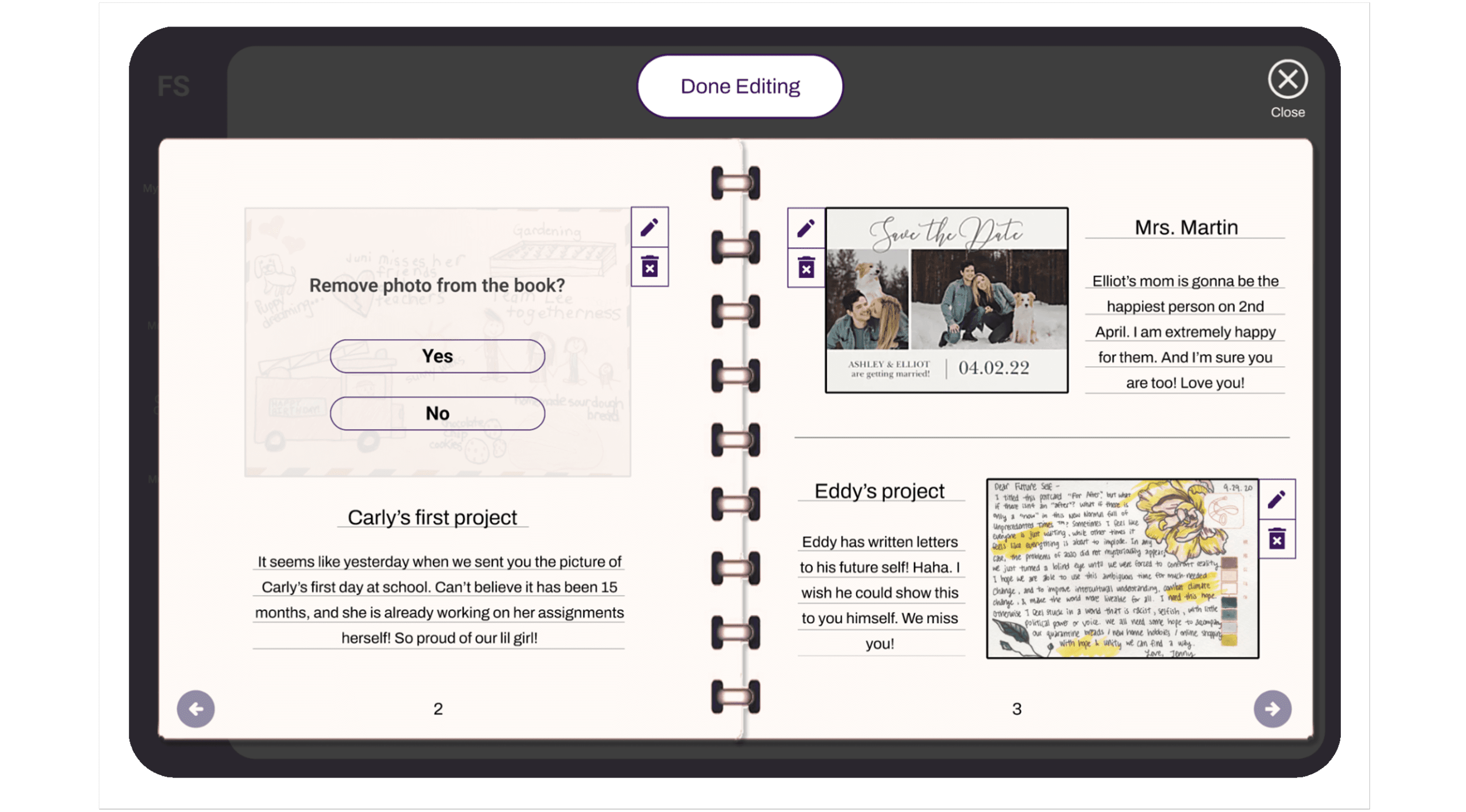
Residents save and categorise favourite postcards into folders. The part that makes it more than a gallery: a collection can be converted into a printed physical album, sent as a reward or a birthday gift by the Flikshop team.
Why it earns its place: it is the only feature where something digital leaves the tablet and becomes an object a person can keep after a transfer, a device swap or release.
Open prototype
Prototype walkthrough
Video slot, waiting on the file
Prototype walkthrough
Video slot, waiting on the file
Feature 04 · Flikshop Home
The post-release hub
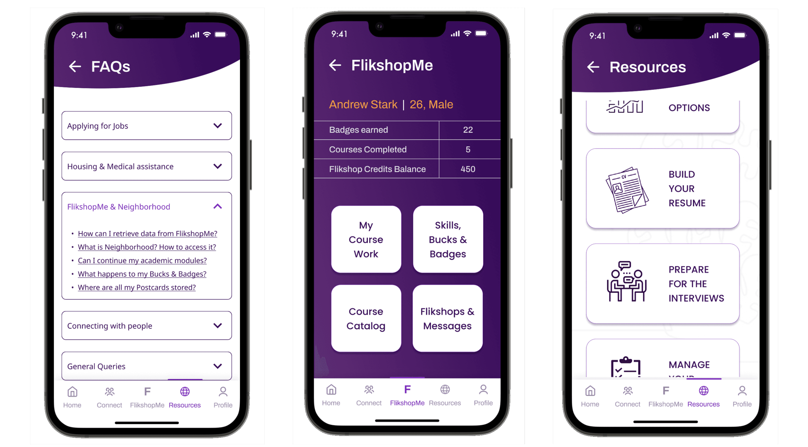
A phone app aimed squarely at the high-friction first months: finding housing, exploring careers, building a résumé, and getting straight answers to the questions nobody hands you on the way out. The profile carries the badges and credits earned inside, so the account is continuous across the gate.
Grounding: more than 600,000 people leave state or federal facilities every year, and joblessness in the years after release runs near 60%. The résumé builder exists because a badge with no document behind it does not get anybody hired.
Open prototype
07 · Reflection
What held up, and what I would not repeat
Worked
Constraints as component states
Treating "a state may switch this off" as a component state rather than a scoping problem is the decision the whole library rests on. It is also the reason the client could take the postcard work forward without the LMS being finished.
Would change
The sprint format set my research budget
Stretching five days to five weeks bought clearance time, but I still front-loaded interviews into one week. With hindsight I would have run the proxy interviews continuously and treated week 4 as a second listening round rather than a build sprint.
Unresolved
Untested with a current resident
Every screen was reviewed by an ex-resident who served 22 years, which is the strongest proxy available to us, and it is still a proxy. Until the tablet build reaches a facility, the usability claims in this case study are hypotheses.
The thing I got wrong first
My initial reward model let bucks buy cosmetic profile items. An expert interview took it apart in one sentence: status inside a facility is not neutral, and a visible marker of who has more currency creates a problem for the person holding it. Every cosmetic sink came out that week.
What facilitating taught me
Running the sprint meant I stopped being the person with the best idea and became the person keeping five people's ideas comparable. Crazy 8s works because it separates volume from judgement, and my job was to protect that gap, especially when the regulation answer was still unknown.
08 · Impact and next steps
Handover and next steps
Delivered to the client
A market study, research findings on the transition to "returning citizen" status, a unified component library, four high-fidelity prototypes, and a roadmap for the Flikshop Neighborhood app. The client is prioritising the tablet features; our team volunteered to mentor the next cohort of students so that Flikshop Home gets built rather than shelved.
Why the timing matters
Pell Grants were restored to incarcerated students in July 2023 after nearly thirty years, making roughly 760,000 people eligible for federal aid to study inside. The demand for a usable, offline-tolerant LMS on a facility tablet is about to be larger than the supply of good ones.
Vera Institute of Justice; U.S. Department of Education.
As a life-long student of design, I'm continuously improving my work. Please look forward to more updates.
References
Sources
01
Bureau of Justice Statistics. Recidivism of Prisoners Released in 34 States in 2012: A 5-Year Follow-Up Period (2012 to 2017). Cumulative arrest rates of 36.8%, 52.9%, 61.5%, 67.0% and 70.8%.
02
Davis, L. et al., RAND Corporation. Evaluating the Effectiveness of Correctional Education: A Meta-Analysis of Programs That Provide Education to Incarcerated Adults (RR-266). 43% lower odds of recidivating; 13% higher odds of post-release employment.
03
RAND Corporation. Serving Time or Wasting Time? (IG-113). 30% vs 43% recidivism; $1,400 to $1,744 per participant; about $5 saved per $1 spent; $8,700 to $9,700 saved per participant over three years; +28% employment odds for vocational training.
04
RAND Corporation. Correctional Education in the United States: How Effective Is It, and How Can We Move the Field Forward? (RB-9763). State-level technology access figures.
05
Rabuy, B. and Kopf, D., Prison Policy Initiative. Separation by Bars and Miles: Visitation in state prisons. 63% held over 100 miles from family; visit rates of 49.6%, 40.0%, 25.9% and 14.5% by distance band.
06
Prison Policy Initiative. Research roundup: The positive impacts of family contact for incarcerated people and their families. Minnesota, Florida and Iowa visitation findings.
07
National Center for Education Statistics. PIAAC U.S. Prison Study, 2014. Approximately 39% of the incarcerated sample did not or could not take the assessment on a computer.
08
Vera Institute of Justice. After 30 Years, the First Program to Offer Pell Grants to Incarcerated Students Has Launched. About 760,000 people eligible; 600,000+ released annually.
09
Prison Policy Initiative. New data on formerly incarcerated people's employment reveal labor market injustices, 2022. Joblessness near 60% in the four years after federal release.
10
Knapp, J., Zeratsky, J. and Kowitz, B. Sprint. Google Ventures design sprint method, adapted here to a five-week cycle.
Flikshop · Bridging the digital divide for social good
Sashank Mullapudi's Portfolio © 2026-27. Designed by Sashank Mullapudi.