HeLA
A conversational AI coach for a fifteen week diet programme. The coach becomes an app that answers back, and the conversational UX keeps her voice.
Conversational AI
Conversational UX
Voice interface
Product Video
Play the Prototype


Industry
Nutrition & metabolic health · Coaching
Team
2 members
Platform
Mobile · Conversational AI
My roles
Product Strategy · Conversational UX · UX Research · IA · UI · Prototyping
Tools
Figma · Claude Design · Maze · Cursor
Timeline
4 Weeks (Passion project)
Deliverables
Working prototype · Walkthrough video
Focus
Conversational AI · Conversational UX · Voice UI
At a glance
The coach is the product. She just cannot scale.
A real fifteen week programme runs on a WhatsApp group, a Sunday phone call and a PDF chart. It works, until forty people ask the same question at once. HeLA turns that coach into a conversational AI product without turning her into a chatbot. The week arrives as a story, the chart stays searchable, and she answers in whatever format makes the answer land fastest. The work is conversational UX end to end: when she speaks first, how a reply is paced, and when the AI hands a question back to the real coach.
101M
adults in India live with diabetes
ICMR-INDIAB, Lancet 2023 [1]
136M
more have prediabetes, the window where diet still works
ICMR-INDIAB [1]
62%
of Indian energy intake comes from carbohydrate
ICMR-INDIAB-21 [2]
<45%
is what the national guideline recommends from cereals
ICMR-NIN 2024 [3]
3%
of health and fitness app installs are still active on day 30
Business of Apps [4]
70%
abandon a digital health programme inside 100 days
Scoping review [5]
15
weeks, each one removing something different from the plate
The programme
9
conversational reply formats, from voice notes to flowcharts
This project
The loop the whole product is built around
Every Sunday a new week lands, and everything she knows about it stays one tap away until the next one.
01 Sunday
The week lands
new rules, in her voice
02 Story
Read to you once
tap through the slides
03 Chart
Kept forever
searchable, never buried
04 Ask
Ask her anything
conversational AI, typed or spoken
05 Card
She notices
one card, the right one
06 Circle
The group keeps going
recipes, trails, wins
The next week starts from what she saw in this one
Phase 01 · Observe
Join the programme
Participant observation inside a live cohort, and the group thread coded end to end.
Phase 02 · Route
Decide who answers what
Interviews and a teardown, sorted into what the conversational AI settles and what the coach keeps.
Phase 03 · Build
Design the conversation
Conversational UX for chat and voice, three passes at home, then a working prototype in Cursor and Claude Design.
Phase 04 · Test
Hand it to other people
Two rounds of unmoderated Maze tests, and four changes that came straight out of round one.
01 · The problem
Everyone gets the same answer, eventually
One coach. One group. A new cohort joining every week, so at any moment someone is in week 1 and someone is in week 12, reading the same thread.
How the programme reaches a participant today
And where it breaks. Observed inside a live cohort.
Functional
The chart is write only
A PDF in a chat thread cannot be searched, filtered or asked a question. By Wednesday it is three hundred messages up.
Human
One person cannot hold fifteen weeks
A coach does not know everything. Looking one thing up properly costs her the twenty questions that arrive meanwhile.
Structural
Everyone is in a different week
New people join weekly. One thread serves a week 1 beginner and a week 12 veteran with the same answer.
The reframe
The problem is not that the coach is slow.
It is that her knowledge only exists in conversation, so it has to be delivered again every time someone asks. Everything below is an attempt to give that knowledge a shape you can hold, without losing the person who wrote it.
02 · Why this, for this food
A carb heavy plate, in the country with the most to lose
The programme works by removing a different carbohydrate source each week. That is a much bigger ask on an Indian plate than a Western one, and it is exactly why the weekly chart matters so much.
Share of daily energy from carbohydrate
What people eat, against what the guideline recommends
ICMR-INDIAB-21 national intake [2] against the ICMR-NIN 2024 dietary guideline [3].
Adults in India, in millions
The group a diet can still turn around is the largest one
ICMR-INDIAB national cross sectional study, 2023 [1].
Health app retention, share of installs
Day 1, day 7 and day 30
Category benchmarks for health and fitness apps [4]. A separate review found a median 70% discontinuing a digital health intervention inside 100 days [5].
What it means for the brief
Retention was never going to come from tracking
People do not abandon these programmes because the food is wrong. They abandon them when nothing is expecting them tomorrow.
The existing programme already beats those numbers, because a person is waiting on the other end
So the design brief was to keep the person, not replace her
Every feature in this case study is judged on whether it makes her feel present
03 · Research
We joined the programme before we designed anything
One of us was a participant in a live cohort. That gave us the Sunday calls, the charts, and eight weeks of a group thread to read properly.
Method 01
Participant observation
Inside a running cohort. Every Sunday call, every chart, every week transition.
Method 02
Message log coding
The group thread read end to end and sorted into what people actually ask.
Method 03
Participant interviews
Nine participants at different weeks, plus the two people running it.
Method 04
Competitive teardown
Tracking apps, coaching apps and general conversational AI assistants, judged on one question each.
Message log coding
What the thread was actually full of
Coding the messages was the most useful hour of the project. Four shapes covered nearly all of it, and only one of them needs a human.
Already answered.
Settled in an earlier week, asked again because the chart is unsearchable
Substitution.
“Can I have X instead” where X was never on any list
Peer sourced.
Recipes and workarounds people ask each other for, not the coach
Genuinely new.
A symptom, an exception, a medical edge. This is the one worth her time
Who should answer what
The conversational AI settles most of it, and only escalates what needs a person
What participants wanted, against what it costs to build
Interview asks plotted by how often they came up against build effort. The top left quadrant became the first release.
Green shipped in this prototype, amber is designed but partial, grey is deliberately out.
The one that surprised us
Streaks and badges sat bottom left.
People asked for them almost never, and several said outright that a broken streak is a reason to leave. They exist in the prototype, but quietly, and never on the home card unless something was actually earned.
04 · Design
Six conversational UX decisions that made it not an app
Everything below started as a normal screen and became something else once we watched what people actually did with it. Every clip is recorded from the working prototype, and the walkthrough follows the same seven chapters.
01
Meeting your coach
0:00
02
The week you are in
0:24
03
What changes this week
0:37
04
Asking her something
0:59
05
Talking to her
1:27
06
What she picked out
1:56
07
One card, all week
2:07
Chapter 01 · Meeting your coach
4A · Meeting your coach
She introduces herself before the form does
Sign up is five short steps, but the first thing after the code is Anita, not a field. Every question after that is framed as something she needs to know to do her job.
A person, then a form.
“I have taken four thousand people through this, so I usually notice a week wobbling before you do”
Private by default.
Only you see your weight. Leaderboards show percentage change, never the number
The photo has a reason.
Inches come off weeks before the scale moves, so week 6 and week 12 wait as locked frames
Groups from day one,
with a code to share, because the programme already runs on people doing it together

Sign in
Meet your next self

Verify
A six digit code
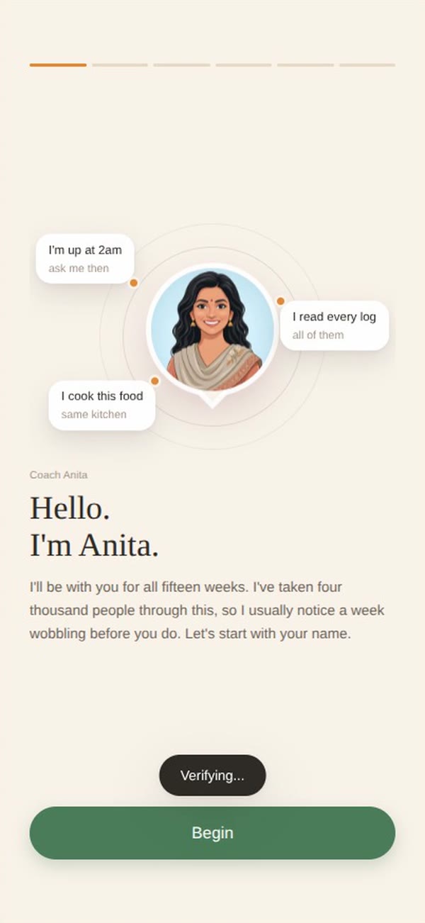
Intro
Hello, I am Anita

Step 1
What should we call you

Step 2
Where you are starting

Step 3
The scale will lie

Step 4
Your group

Step 5
One payment
4B · The trail
A map, not a filter
Fifteen weeks along the top of the home screen. The obvious version made the focused week grow and fill in, which read as a selection, so people expected the page underneath to change. It never did.
Green means week 8, not selected.
Filled is the live week, outlined with a tick is finished, dashed is locked
Browsing gets answered inside the band.
A pill appears there rather than anywhere below
Today steps back.
The greeting, ask bar and card blur out while you browse, so the two zones stop looking related
It returns on its own.
Two and a half seconds after you stop, it eases back to week 8
Browsing week 7 and the return
Chapter 07 · Card states across a week
4C · The card
One card, twelve things it could be
The home screen holds exactly one card. What sits in it depends on the day of the week, the time of day and what you have actually done.
Three beats every time.
What she noticed, what it means for you, one thing to do
One button.
The moment a card has two, it stops sounding like a person
The condition matters more than the copy.
The steps nudge only fires after 3pm, under 80% of goal, and only for someone who usually closes it
A nudge that fires when it should not costs more trust than three good cards earn.

State 01
A nudge, nothing more
2,580 steps left, and the note that it is always the walk after dinner that does it

State 02
Something I spotted
Three dinners after 9:40, plotted against a 7:30 line

State 03
Your weakest link
6.4 hours against the 7.5 needed, and what the gap costs

State 04
Weekly check in
No data in this one at all. She just has not heard from you

State 05
Recipe you wanted
A question from week 5 that finally has an answer in the feed

State 06
Same loop every day
Eleven logs of the same route, so someone found you another
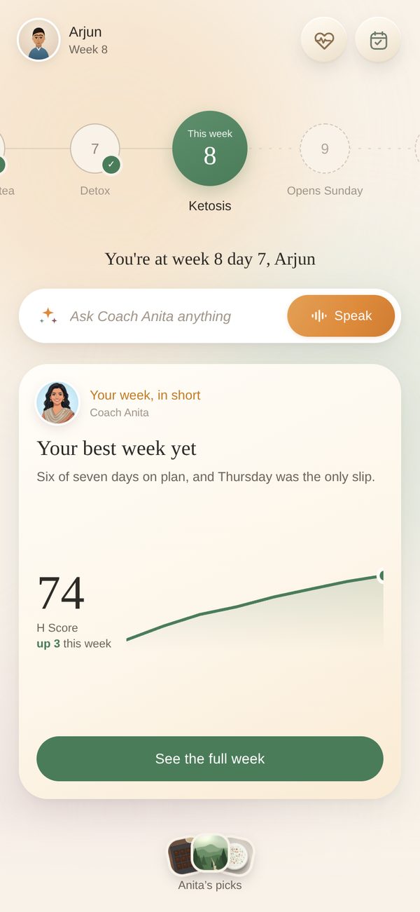
State 07
Your week, in short
The H Score climbing across eight weeks, not a row of circles

State 08
Your Circle this week
68,412 steps between six people, which is twice across Atlanta
4C · When three things are true at once
A deck, not a stack
On a Saturday a recap, a live nudge and a milestone can all qualify. Stacking them vertically would bury the week under the noise.
Two edges peek below the front card, scaled down, so you know they are there without reading them
Swipe either way, or tap the dots. Cards you pass park off to the left and come back
The front card nudges twice on arrival to teach the gesture
The Saturday deck
Chapter 04 · Replies arriving beat by beat
4D · Conversational UX · The chat
Answers that are not always paragraphs
The first build was a generic AI chatbot, and it read like one. The conversational UX problem was that a coach does not reply to everything in prose. She draws it, sends a photo, or records fifteen seconds instead.
Replies arrive as beats,
one at a time with the typing indicator between, the way a person sends three messages
Nine formats.
Text, voice note, flowchart, swap card, photo, video, meter, written note, and a question back
“Can I have X” gets a decision tree,
so she answers every food at once instead of one at a time
She opens threads herself.
A morning check in, a fact sent for no reason, a nudge that arrives while you sit there

She goes first
Timestamped, with no question bubble above it, because she started this one
Drawn, not written
Three questions that settle every food on the list

Passed along
The week release with the clip attached, not described
4E · Conversational AI · Voice
She points at things while she talks
Conversational AI voice modes usually show you a transcript of what they just said, which nobody reads. We took both transcripts out and put the slides in instead.
Her face, the same size throughout.
A visual pushes her up rather than shrinking her
Visuals change mid sentence,
lifting out upward and rising in from below so arriving and leaving are different motions
She can point.
Ask about pumpkin and the tile scales up while the other three dim, without reloading the slide
Interrupt anytime.
Stop speaking and mute, both icon only, both in the same treatment as close
Chapter 05 · Slides changing mid sentence

Listening
One sine line at 42% opacity. Deliberately quiet

Speaking
Orange ring radiating, the slide holding the middle

Pointing
The same slide, one tile in focus and three dimmed
Chapter 03 · The week read out, then the chart
4F · The week
Read to you once, then kept forever
The Sunday call becomes a story you tap through, narrated in her voice. The PDF becomes the last slide, and it never gets buried.
The chart builds itself from the slides
you were just read, so the two can never drift apart
Five sections:
off the plate, on the plate, vegetables with no limit, the daily habits, and the rules that are not a food
Pictures, not word lists.
38 tiles for week 8, 11 of them crossed through
That last section exists because “cook the vegetables well” is the kind of instruction a chart always drops

The opening
Narrated in her voice, one card at a time

What replaces it
Every removal is paired with the thing that takes its place

The chart
Scrolls on its own, searchable, always one tap from home
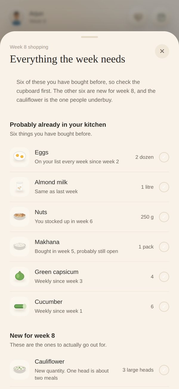
Before you shop
Split by what you probably already own
05 · Structure
Two zones that kept getting confused for one
The home screen carries the programme and the day at the same time. Almost every usability problem we hit came from people reading one as belonging to the other.
Identity.
Who you are and which week you are in. Never changes while you browse
The programme.
Fifteen weeks as an index. A map you look things up in
Now.
The greeting, the ask bar and the card. Today, not week 8
Her one thing.
Fixed height, always clears the drawer, never two cards deep
The group.
Three feed thumbnails tucked into the bottom edge. Pull to open
The fix was behavioural, not visual
What actually worked was making the trail return to week 8 by itself,
so the false state never lingers. We tried separating the zones with borders and backgrounds first.
The group zone
A drawer, so the thread stops burying the chart
Recipes, trails and wins used to live in the same thread as the rules. They now sit in a drawer at the bottom edge of home, curated as Anita’s picks and posted by people on the same plan.
Pulled up, never pushed.
Three thumbnails peek above the fold and the rest waits until you ask
Her picks first.
Posts from the group arrive with the week they belong to, so a week 3 recipe does not tempt a week 8 plate
Ask the feed.
“Share a recipe, a trail, a win” sits at the top, in the same shape as the ask bar
Chapter 06 · What she picked out
Three passes at the same screen
The behaviour was settled in low fidelity before any of it got a surface.
Pass 01
A normal app
Five tabs, week strip at the bottom, a dashboard of numbers. It tested as a tracker, and nobody mentioned the coach.
Pass 02
Tabs removed
One surface, a sine wave trail and a conversational entry point. The wave looked good and made the weeks hard to compare.
Pass 03 · Shipped
One card, fixed height
Trail flattened so weeks compare at a glance, voice given its own pill inside the field, and the card locked to one height so the drawer never collides.
06 · System
A palette that had to survive being read in a kitchen
Fewer values, each with a job. The audit halfway through mattered more than any single colour choice.
Five rules
Two surfaces, not six.
Sand is the ground, a warm off white is content. Everything else was collapsing into the same cream
Green means the live week.
Nothing else gets it, so it never has to compete with focus
Filled against outlined
does the work colour was doing, which frees colour to mean one thing
No capitals anywhere in the app.
35 rules of uppercase micro labels were stripped out. They were the most dated thing in the design and the slowest to read
Shadow or border, never both.
Elevation had stopped meaning anything consistent
The system after the audit
Surface, meaning and type
An audit halfway through changed the type
71 rules were setting text below 11px, and the secondary ink was failing contrast at 2.60:1 against the ground.
For a user group that skews over forty and reads at arm’s length while cooking, that is not a polish problem. The floor went to 11px and the secondary ink moved to 5.19:1.
07 · Testing
What broke when other people held it
Unmoderated task tests in Maze against the live prototype, run with people currently on or recently off a structured diet plan.
14
participants across two rounds
6
tasks, from finding a rule to asking a question out loud
4
design changes that came directly out of round one
0
moderated sessions, which is the honest gap
What we saw
Why it happened
What changed
People scrolled the trail, then waited
The focused week grew and filled green, which reads as a selection everywhere else in software
Green reserved for the live week, a pill inside the band, today blurred out, and an automatic return
The card got skimmed past
It opened with a label rather than an observation, so it read as a banner
Header became three or four words naming what she is doing. The title became the thing she noticed
Nobody found voice
It was a small orange mic inside the input, indistinguishable from dictation
A labelled pill holding 30% of the field, with a breathing halo rather than a bouncing waveform
The photo step was skipped
“Take a selfie” with no reason attached, at the point people are still deciding whether to trust this
Reframed on inch loss, with week 6 and week 12 shown as locked frames waiting to be filled
The one we did not act on
Two people wanted the chart on a permanent tab.
We left it one tap from home instead, because a tab would have pulled the app back toward being a reference tool, which is the shape we spent the whole project getting away from.
08 · Reflection
Designing it by building it
01
The coach was the constraint
Every feature was judged on one question: does this make her more present or less. Anything that made the app feel like software got cut, including features people asked for.
02
Format is the design
The hardest conversational UX work was not the copy. It was deciding when a flowchart beats a paragraph, and building nine formats so the AI could choose the way she would.
03
Behaviour beat styling
The trail confusion survived three visual treatments and was fixed by a two second timer. Not every hierarchy problem is a hierarchy problem.
Handover and next steps
Where it goes next
Moderated sessions with real participants,
mid programme rather than cold. Unmoderated tests cannot tell us whether she feels like a person over fifteen weeks
The AI routing has to be proven.
The whole premise is that the conversational AI settles three question types and escalates the fourth. That needs measuring against a real thread
Coach tooling.
Nothing here is designed for the person on the other side, who currently has no way to see what the app answered on her behalf
Regional plates.
The chart is built on one cuisine. The model should hold, the art will not
Built with
Two people, four weeks
Shafiqah Zulfikar and I built HeLA together over four weeks. Shafiqah is a Vice President of Design at JPMorganChase, and brought the research structure and the pressure testing that stopped several of these ideas early.
I owned product strategy, the information architecture, the card system, the conversational UX, the AI reply formats and the voice interface, and built the working prototype in Cursor and Claude Design alongside the Figma work.
The underlying programme is a real one, run in person by someone we know. It is not named here and nothing in this case study is published with its materials. The screens, the coach and the cohort are our own.
References
1 · Anjana, R. M. et al. Metabolic non-communicable disease health report of India: the ICMR-INDIAB national cross-sectional study (ICMR-INDIAB-17). The Lancet Diabetes and Endocrinology, 2023.
2 · ICMR-INDIAB-21, national macronutrient intake, as reported in the I-STARCH-1 multicentric study of Indian adults with and without type 2 diabetes.
3 · ICMR-National Institute of Nutrition. Dietary Guidelines for Indians, 2024 edition. nin.res.in
4 · Business of Apps. Health and Fitness App Benchmarks, day 1, day 7 and day 30 retention.
5 · Scoping review of lifestyle and mental health app discontinuation, median 70% within 100 days, as compiled in health app churn analysis.
6 · Grand View Research. Fitness Apps Market Size, Share and Trends Report.
HeLA · A conversational AI coach who noticed.
Sashank Mullapudi’s Portfolio © 2026-27. Designed by Sashank Mullapudi.