PlayQR
Wait time turned into a game, and the game turned into retail stores' honest source of customer data.

Client
Tata 1mg
Industry
Healthcare retail · Game design
Timeline
6 months
Team
2 Members
My roles
Strategy lead · Designer · Game designer · Researcher · Team lead
Method
Survey · Interviews · Store observation ·
In-store testing
Tools
Figma · Google Forms · Google Sheets · Illustrator
At a glance
A retail strategy project that grew a product
Tata 1mg wanted to move from an online pharmacy to an omnichannel retailer with every health need under one roof. I joined as an off site member of the retail strategy team, and by the fourth phase I had pitched, designed and led the one digital intervention that the physical stores shipped: a gamified feedback kiosk called PlayQR.
47
structured interviews across Tier 1 and Tier 2 cities
9
stores observed, with detailed CX journey mapping in 3 of them
3
pilot stores across Gurugram, Delhi and Jaipur ran the kiosk
38%
of everyone who walked into a store played the game
750+
players and feedback entries captured in 21 days
4.3
average store rating, captured at the counter rather than chased later
1.5x
footfall reported by selected pilot stores, among other business metrics
Phase 1
Spatial experience
Store concept model, diverse formats, retail typology and expansion playbook
Phase 2
Branding and communication
Environmental branding, digital touchpoints, brand playbook
Phase 3
Service ideation
Store service model, health kiosk
Phase 4
Consumer feedback: PlayQR
Gamified feedback, self service engagement, data collection.
Ideator, designer, team lead.
Phases 1 to 3: off site member of the 10+ person strategy team. Phase 4: I proposed the project, and led it from concept to in store testing.
01 · Discover and define
Where the waiting actually hurts
The brief was to build the design strategy for an integrated healthcare retail model and deliver 50 pilot stores, covering the complete spatial experience and communication design. Before anyone could design a shelf, we had to know what an Indian pharmacy visit really feels like.
The brief
To create the design strategy for 1mg's integrated healthcare retail model and deliver 50 pilot stores.
Scope. Complete spatial experience and communication design. The pilot focused on Delhi NCR, Jaipur, Kolkata and Dehradun.
My contribution in this phase
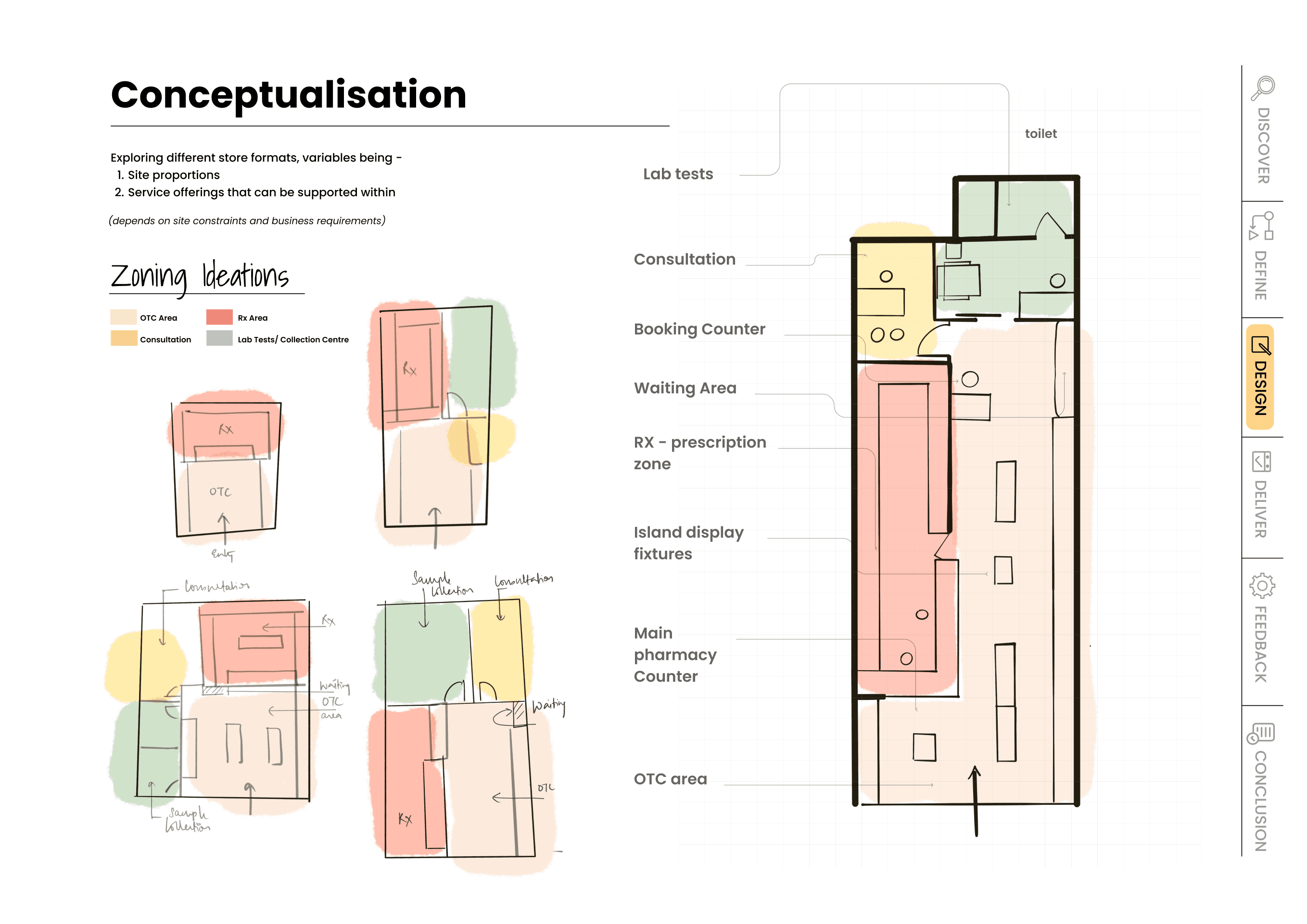
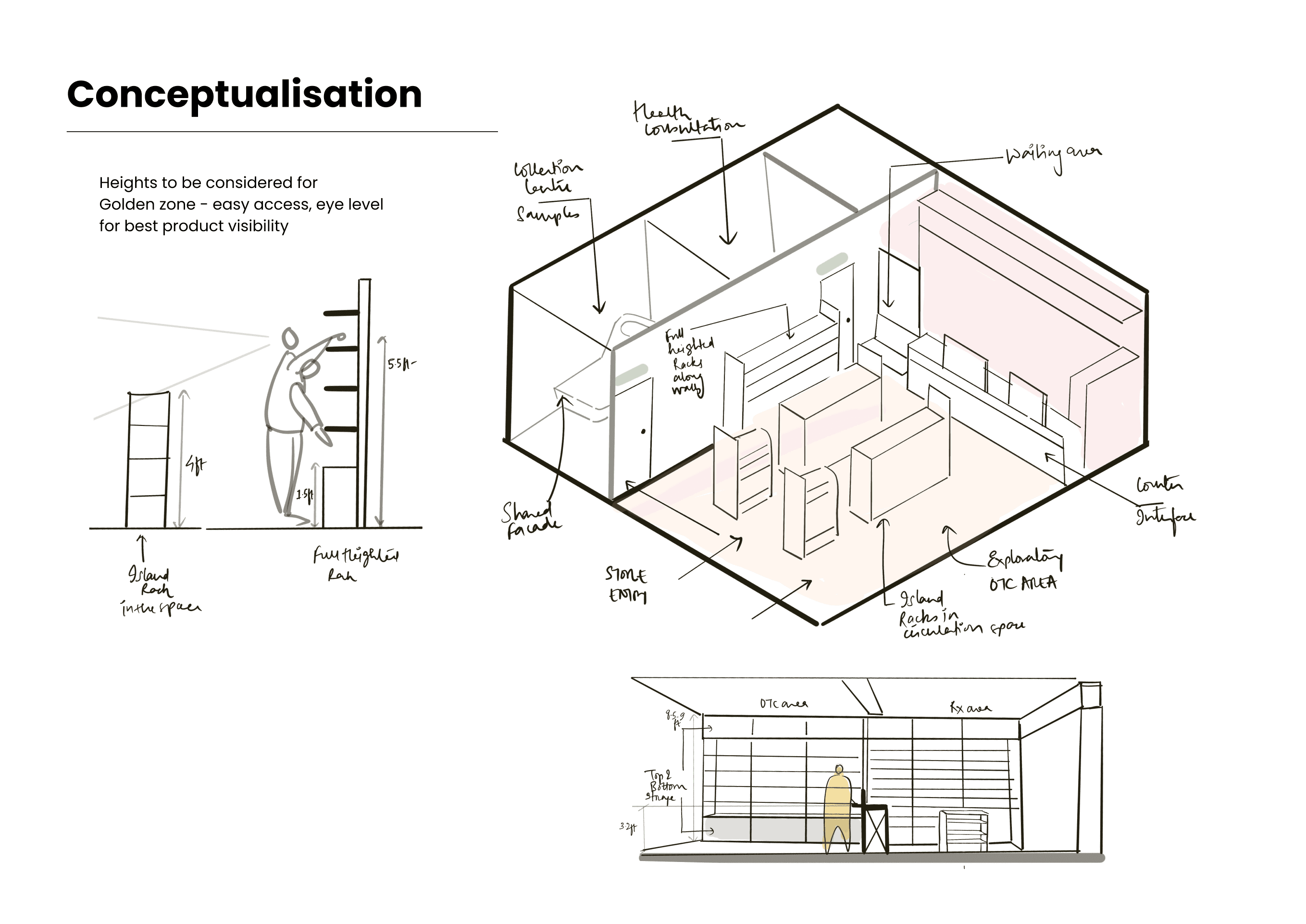
As a core member of the strategy team I helped structure the survey methodology, synthesised the findings, and worked on the retail typologies and space ergonomics. This is the work that surfaced long waits and a flat, unengaging counter experience as the two things worth intervening in.
Survey design
Synthesis
Retail typologies
Space ergonomics
Zoning
336
Online survey
How people perceive and interact with pharmacies in cities. 40% female and 60% male, 61% between 18 and 30, 35.5% between 31 and 60. Run on Google Forms.
6
Sections in the questionnaire
Demographics and immediate health issues, medicines, doctors and healthcare, lab tests, awareness around health, and health information and education. Each section asked about source, preference, access, pain points and what the city was missing.
47
Structured interviews
In person and on call, 20 to 30 minutes each. 45% female and 55% male, 75% between 24 and 40. Weighted towards people with chronic health issues or who manage care for a family member.
9
Stores observed
Existing 1mg stores across Kolkata, Gurugram and Jaipur, photographed and audited against the model we were proposing.
3
Detailed CX journeys
Consumer journey mapping in three key stores, Galleria among them: every touchpoint timed, with observations and inferences recorded per customer.
89%
prefer buying medicines from a physical pharmacy over an online service, because the order is fulfilled immediately. The remaining 11% choose online for ease and convenience.
This is the number that made the physical store worth investing in at all, for a company known for delivery.
30%
of customers who browse a pharmacy buy something that was not on their list. The counter is not a queue, it is a shelf people are already looking at.
What the research settled
Insight 01
Tier 1 buys time, Tier 2 buys access
Tier 1 residents talked about time and service offerings, and 40% of them measure their health stats or take a proactive approach. Tier 2 residents talked about whether the medicine exists nearby at all, and lean on the pharmacist for advice. One store model could not speak to both in the same voice.
Insight 02
Trust is built at the counter, not on the shelf
"Building trust with the professional is key." People wanted the same doctor, the same pharmacist, an explanation of what they were buying and why. The counter is where that relationship is either made or missed.
Insight 03
Waiting is the only time you have their attention
"Lot of waiting at billing counters." "Only 1 out of two or three counters are open all the time." In store observation confirmed it: customers spend their longest single stretch at the counter top, looking at the impulse shelf, doing nothing.
Insight 04
In a premium market the wait is short, so the moment has to be sharp
At Galleria, a high footfall premium store, transactions were fast and the store was small, so staff had almost no window to engage anyone. Any intervention here had to be self serve and it had to be over in under two minutes.

02 · The problem worth solving
A pilot you cannot measure is not a pilot
Fifty stores were being built on a set of design bets. The only way to know whether the bets were right was to ask the people walking through them. The mechanism for asking was a generic five pointer scoring device sitting on some counters, and it was not working.
Customers intentionally skip the form
→
No time to stand and fill out a lengthy form, and no interest in engaging with it in the first place
People enter incorrect personal details
→
Avoiding spam mail and SMS from the company, and a sense of privacy that makes them hold back real information
Random and inappropriate feedback
→
Time pressure to finish and make way for the next customer, and no incentive to fill it in honestly and sincerely
Feedback forms go unnoticed
→
The form simply fails to catch a customer's attention at all
What was already installed
A generic five pointer feedback scoring mechanism on some store counters. Four things were wrong with it:
· Cumbersome interface
· Often gets missed
· Random scoring
· Too generic to derive any significant insight
I asked to lead the project for designing a better feedback mechanism that could be engaging, and give us the right feedback in this crucial pilot stage.
The ask I made to the business team, which became Phase 4
03 · The concept
Stop giving the discount. Let them earn it.
Every one of those four failures is a motivation problem, not an interface problem. A nicer form would still be a form. The store was already handing out discounts as a matter of policy, which meant there was a reward sitting on the table with nothing asked of the customer in return.
“Since discounts are being provided anyway, why not make the customer feel like they have earned them?”
The reframe the whole project rests on. Same cost to the business, completely different feeling for the customer, and a fair reason to ask them for two minutes and a phone number.
What the model had to do
Draw attention using game elements, so it is not something you walk past
Engage by touch, a real gameplay interaction rather than a tap through
Ask afterwards, so the questions land on someone who is already enjoying themselves
And it had to earn
Correct personal information, because the coupon only arrives if the number is real
Ad placements and promotions, a surface the business could use
An ending on a high note, so the last thing a customer feels in the store is a small win
Constraints I set
Gameplay length
15 to 20 s
Whole interaction
≤ 2 min
Device
13" tablet
Orientation
Landscape
Mount height
~4 ft
Position
At billing
Android, touch enabled, on a floor stand next to the billing counter. Everything else was designed to fit inside these numbers.
The plan I took to the business team
Goal
Design an engaging feedback kiosk that gathers honest and direct store insights from customers, and rewards them for the interaction.
Scope
· Know customer demographics
· Engage them in a game
· Short and quick feedback on the store
· Collect phone number and email
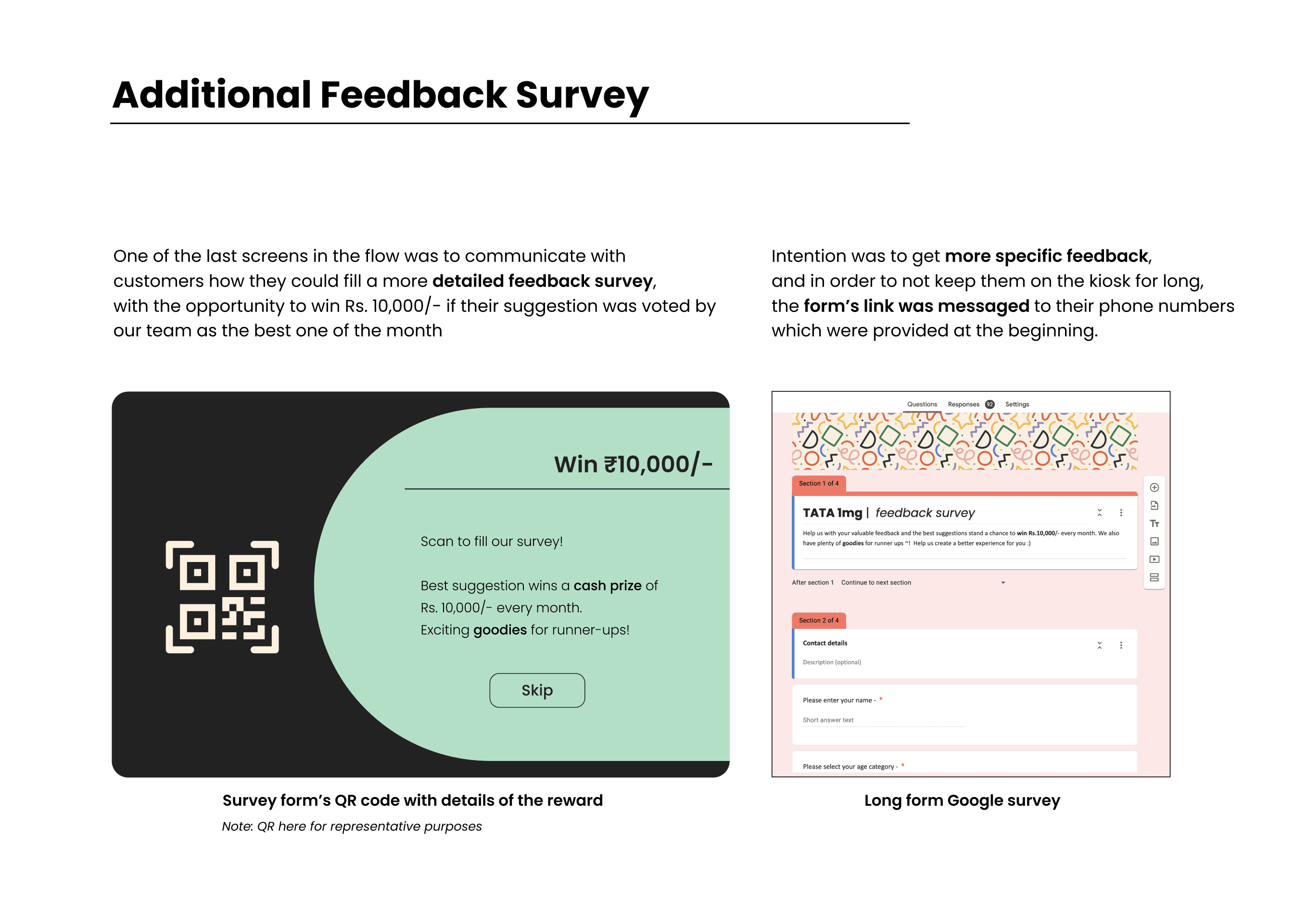
· Offer a long form survey for an extra reward of ₹10,000 a month for the best suggestion
Deliverables
· Design of the application
· Back end data collection and insights
· Kiosk specifications
· Onboarding videos and an active demonstration for pharmacy staff
The team I led
Self, strategy lead and UX
Feedback concept, ideation, game design, application flow, UI and UX, kiosk specification, staff onboarding material
On site lead consultant, Tata 1mg
Data insights and project lead until execution
Application developer, IIT Roorkee
Coding, app development and back end support
Pharmacy staff
Learning the flow, helping customers with queries on rewards and feedback, and pitching it during peak hours
Timeline inside the six months
Conceptualisation
4 to 5 wks
App development and changes
4 wks
Implement and onboard in stores
3 wks
Feedback, changes and iterations
3 wks
Phase 1 concept model, Phase 2 development, execution and feedback, Phase 3 analysis of the data collected and the changes each store should make because of it.
04 · Interaction and game design
A capsule, a truck, and twenty seconds of luck
Tata 1mg began life as an online medicine delivery company, and most people still picture it that way. So rather than invent a mascot, I made the game out of the thing the brand already is: a capsule, being pulled forward by a delivery truck.
The narrative
Every screen is one frame of a delivery
The mint shape on every screen is a capsule. It is being dragged along a red line by a Tata 1mg truck, and its shape changes as you move through the flow: a small bulge at the phone number screen, a full screen of green at the moment of play, then receding to the right as your coupon leaves for your phone. The progress bar is the brand.
The mechanic
A simple mix of control and luck
Pinball inspired. The player chooses the lane the capsule drops from, which is the control. It then tumbles through a maze of pins into one of the buckets, or escapes, which is the luck. Where it lands decides the freebie, offer or discount percentage won. The whole thing resolves in 15 to 20 seconds, so the gratification is instant and the queue keeps moving.
The capsule as a progress bar
Read left to right. The same shape carries you from the attract screen to the coupon.

A kiosk has no scroll bar, no browser chrome and no time for a stepper. The shape of the green is the only progress indicator the screen needs, and it belongs to the brand rather than to a UI kit.
The screens
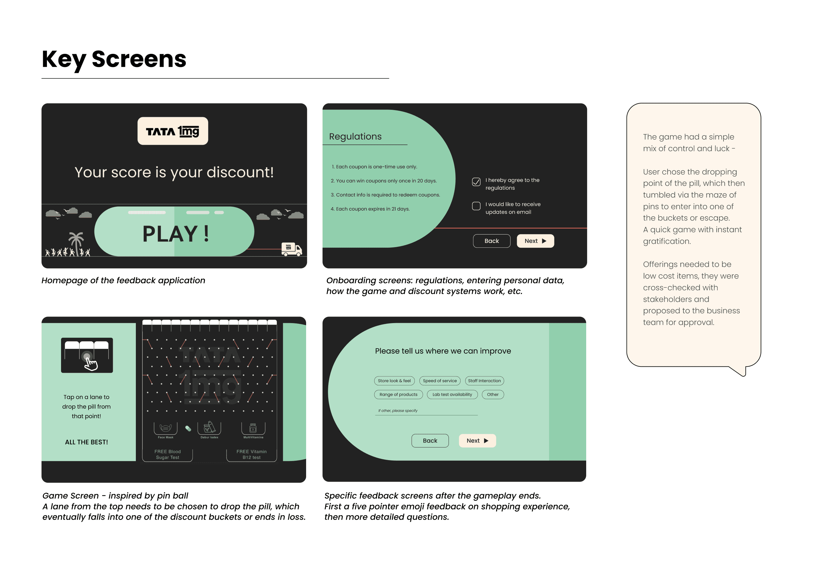
Nine screens, 13 inch landscape, all of them designed to be readable while standing and operable with one hand holding a shopping basket. English and Hindi are offered from the first screen.


Reading the board
Control, then luck
The player taps a lane at the top, which is the control. The capsule tumbles through a maze of pins with coral deflectors and lands in one of the buckets, or escapes, which is the luck. Fifteen to twenty seconds, start to finish.
Everything on the board is a low cost item: a face mask, a Dabur Iodex, a strip of multivitamins, a free blood sugar or Vitamin B12 test, or 5 to 20% off. Every offering was cross checked with stakeholders and approved by the business team before it went on a lane.
05 Drop the Pill
Twelve lanes at the top, a maze of pins with coral deflectors, and the prize buckets along the bottom. Buckets were tuned with the on site consultant so the expected payout matched what the store was already discounting. Everything on the board is a low cost item, and every offering was cross checked with stakeholders and approved by the business team before it went on a lane.


05 · From flow to floor
Getting it out of Figma and onto a counter
A kiosk is not a screen, it is a piece of furniture in someone's shop with staff standing next to it. Half of this phase was interaction design, and half of it was specification, training and signage.
Test, phase 1
36 Tata 1mg office employees
An internal round on user flow, interface and offerings, and the bug fixes that only show up in a real deployment: the SMS service that carries the coupon, and the back end data logs that everything downstream depends on.
Test, phase 2
86 consumers in one retail store
A live store, real customers, real queue. This is where flow issues surfaced that no office test would have caught, and where the analysis reports at the back end were checked against what actually happened on the floor.

Implementation
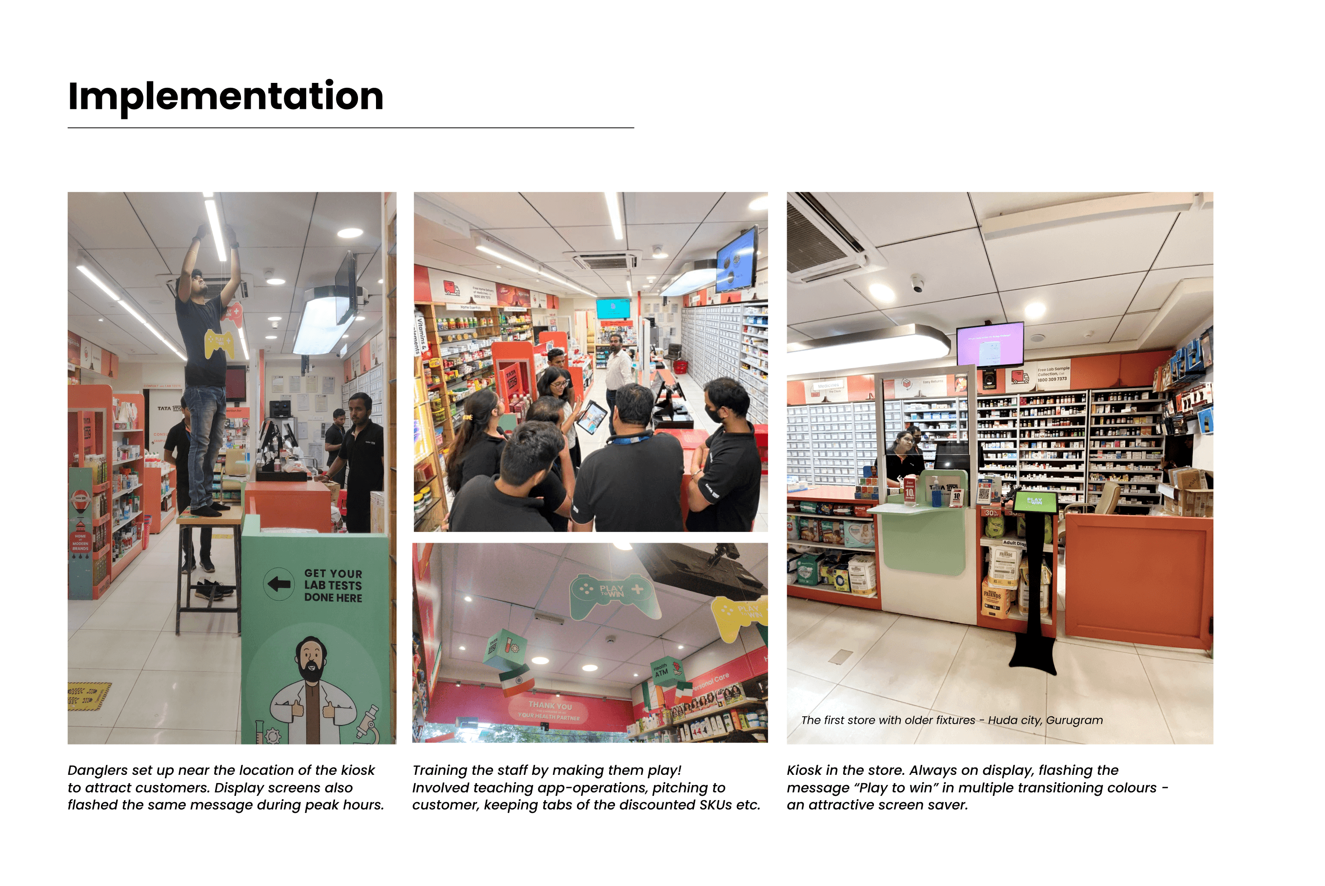
The part that is not a screen
Staff onboarding
Training meant making the staff play it first. After that they could operate the app, pitch it to customers, and keep track of which discounted SKUs were moving.
Attention before interaction
Danglers over the aisle, in game controller and pill shapes, plus the in store display screens carrying the same message at peak hours.
Kiosk specification
13 inch Android tablet, landscape locked, on a floor stand at roughly 4 feet, positioned so that the person queueing at billing can reach it without leaving the queue.
06 · What happened
People played, and then they told us things
The pilot ran in three stores across Gurugram, Delhi and Jaipur for 21 days. The number I care about most is not the footfall lift, it is that 38% of everyone who walked through the door chose to stand at a tablet and answer questions about the shop.
750+
players and feedback entries in 21 days across three pilot stores
38%
of walk in consumers engaged with the kiosk, on average
4.3
average rating of the store experience, captured in the moment
155
long form survey responses, filled later on people's own phones
Business outcome
Footfall in selected pilot stores
1.5x
Feedback entries captured
750
Average rating
4.3
Engagement rate of walk ins
38%
Stores
3
Days
21
The idea was presented to investors as consumer centred, design led retail innovation. Customers who played it became natural promoters for the brand, which is a return the feedback form was never going to produce.
What people actually asked for
Verbatim suggestions from the long form survey. This is the material a generic five pointer could never have produced, and it is specific enough for a single store to act on.
“Basic body vitals check up. Health checkup.”
“BMI machine in the store.”
“On spot sample could be collected for lab tests. Membership or something to have better offers.”
“Please sync online pricing with offline store pricing.”
“Better layout of products on racks. Add more homeopathic medicine.”
“Ask for drinking water. Customer friendly for older people and disabled persons.”
“Doctor consultation and doctor tie ups will be beneficial for the growth of the store.”
“Its a good store compared to other healthcare stores. I think you are way ahead of your competitors.”
Feedback forms were being skipped
→
38% of walk ins played, unprompted, because the reward came before the ask
People entered fake contact details
→
The coupon only arrives by SMS, so a real number is the price of the prize. A confirm step catches the rest
Scoring was random and unconsidered
→
Questions land after the win, on a customer who is enjoying themselves, and the average rating of 4.3 came with 750 specific parameter choices behind it
Too generic to derive any insight
→
Long form questions moved off the kiosk and onto the customer's phone by SMS, which is where the 155 written suggestions came from without adding a second to dwell time
07 · Reflection
What I would defend, and what I got wrong
The decision I would defend hardest
Putting the reward before the questions. Every feedback system I have seen asks first and thanks you afterwards, which makes the customer the one doing the favour. Inverting it cost the business nothing, since the discount was already budgeted, and it changed the entire emotional shape of the interaction.
The thing I underestimated
The back end. Designing the game was the fast part. Streaming the data cleanly out of three stores, keeping the SMS service reliable and making the logs trustworthy was what actually decided whether the idea could scale, and it is the reason the rollout is staged rather than immediate.
What running it taught me
I came into this project as an off site assistant on a 10+ person team and ended it leading a three person build with a client consultant and a developer. The skill that mattered was not visual: it was pitching an idea to a business team, getting an enthusiastic yes, and then being accountable for the number it produced.
Honest limits of this pilot
No control group
The kiosk was never run against a plain feedback form in a matched store, so the 38% is an absolute number, not a lift over a baseline I can prove.
The footfall figure is the client's
The 1.5x came from the business team's own store metrics and is one of several things happening in a new store at the same time.
Only one of two games shipped
Roll the Dice stayed a Coming Soon tile for the whole pilot, so repeat play was never really tested.
If I ran it again
Instrument the drop off
I know who finished. I do not know how many walked up, saw the phone number field and turned around.
Rotate the questions per store
The system already allows it. During the pilot everyone answered the same three questions, when a store could have been testing a new offering every week.
Design the loss state properly
The capsule can escape the buckets. That moment deserved as much attention as the win, and it did not get it.
08 · Where it goes
Handover and next steps
01
Scale with the next wave of stores
The kiosk goes out with the next expansion once the back end data streaming is completely resolved for scale. Everything else, the app, the specification and the staff onboarding material, is already built.
02
Make the questions store specific
During store operations the feedback can be very store specific and changed regularly, so a manager can test a new offering directly with the customers standing in front of them.
03
Ship the second game
Roll the Dice, so that a regular customer who returns within the coupon window has a reason to play again.
04
Feed the insights back into the store design
The suggestions people wrote, in house consultations, a BMI machine, on the spot sample collection, ayurvedic and homeopathic ranges, wellness products, all point back at the service model from phase 3. The kiosk turned out to be the cheapest research instrument the project had.
PlayQR · Turning dead time at the counter into data the store can act on
Sashank Mullapudi's Portfolio © 2026-27. Designed by Sashank Mullapudi.